2015 Color Trends That Still Influence Today’s Home Design
Color defines atmosphere, sets the mood, and gives personality to your space. While trends come and go, the influence of 2015’s color philosophies continues to shape modern interiors. From muted palettes to bold accents, homeowners discovered how to express their identity through every wall, cabinet, and décor element. At Ram Remodeling in Bloomington, MN, we help clients create cohesive, timeless designs by building upon proven color strategies that still feel fresh today.
1. Understanding Color Philosophies, Not Just Trends
2015 wasn’t about just one “it” color — it was about color philosophies. Major influencers like Pantone, Sherwin-Williams, and Behr released multiple palettes representing distinct lifestyles and aesthetics:
Bold palettes with rich tones like indigo, crimson, and emerald
Neutral bases including greys, taupes, and whites
Modern contrasts pairing bright citrus with dark navy
Soft naturals inspired by clay, stone, and sand
These curated directions allowed designers to balance timeless appeal with personal flair, setting a precedent for how we use color today.
2. How Color Forecasting Works
Colors you see in your tile, paint, or cabinetry were predicted years in advance. Paint companies, fashion designers, and even car manufacturers coordinate palettes to reflect culture, consumer mood, and global events.
Fact:
Pantone’s annual Color of the Year is selected up to two years in advance, based on global influences ranging from fashion to politics to nature.
In 2015, for instance, Marsala — a rich, earthy red — was named Color of the Year by Pantone, a tone that offered depth and warmth to interiors. It showed up in accent walls, velvet chairs, and kitchen accessories.
3. Personalizing Color Within a Trend Framework
You may love a specific color, but that doesn’t mean it works for large surfaces. The key is layering that color into a compatible palette. In 2015, design pros began encouraging homeowners to focus not on matching colors, but balancing them — blending warm and cool tones, mixing matte and gloss textures, and experimenting with contrast.
Examples include:
A deep navy island paired with light grey perimeter cabinets
Rich walnut floors set against soft beige walls
Accents like amethyst throws or emerald barstools to add personality without overwhelming
If you’re curious how color predictions from 2015 still influence today’s remodels, click here.
4. Tools That Emerged to Simplify Color Selection
Color overwhelm is real — especially when staring at dozens of paint swatches. That’s why 2015 also saw the rise of tech tools to help homeowners choose with confidence, including:
Sherwin-Williams ColorSnap app: lets you visualize colors in your space
Pantone Studio: for exploring designer-approved pairings
Online quizzes and mood boards to narrow your style
Design blogs like Design-Seeds, which showcase palettes pulled from nature, fashion, and more
Even with these tools, many still turn to professional designers to bring it all together — blending trend insight with practical layout and lighting considerations.
5. Where 2015 Color Trends Still Shine Today
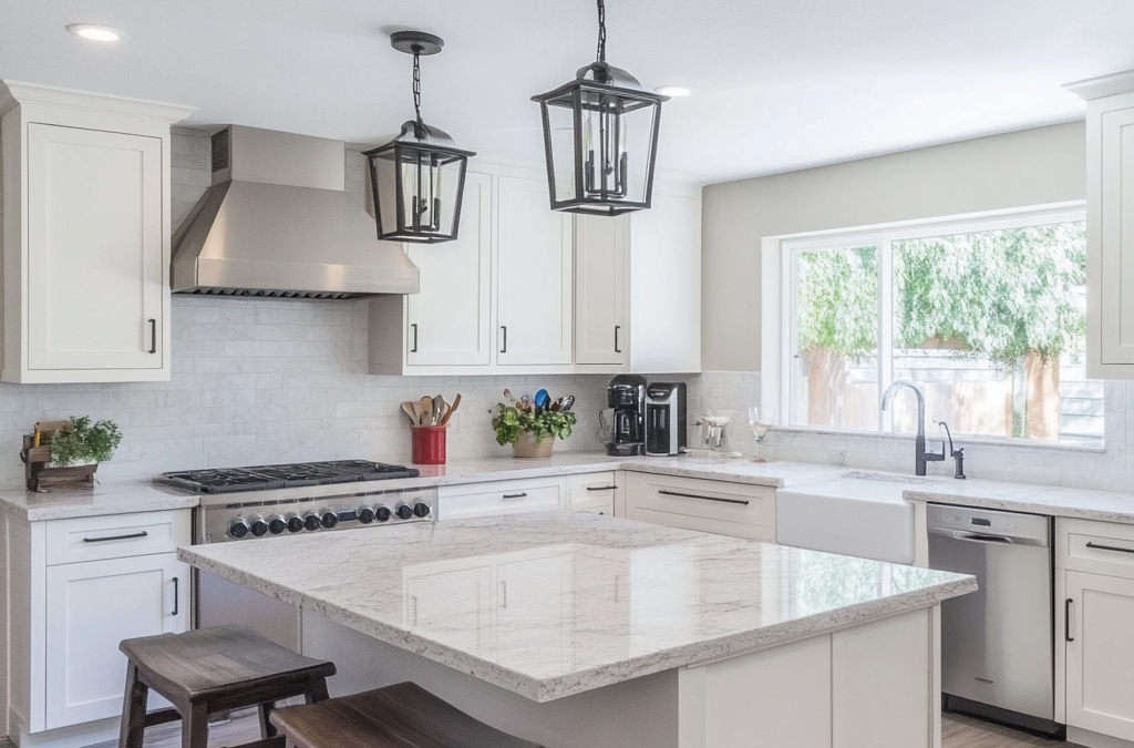
The appeal of 2015’s color palettes is their timeless adaptability. Neutral foundations like soft grey, creamy beige, and cloud white are still top choices for cabinetry and walls. Bolder 2015 tones like teal, ochre, and wine have evolved into modern accent colors for tile, rugs, and feature walls.
Today’s kitchens, baths, and living spaces still pull from these enduring hues — but with more flexibility in how they’re applied.
Bringing It All Together Since the ’70s
At Ram Remodeling, we understand that color is deeply personal — and deeply impactful. As a family-owned business in Bloomington, MN since the 1970s, we’ve helped hundreds of homeowners discover the perfect palette to match their style, light, and architecture. Whether you want to embrace trend-setting hues or stick with the classics, we’ll help you build a color story that feels distinctly yours.
FAQs
How do I choose a color palette that won’t go out of style?
Stick with neutrals for main elements (walls, cabinets) and layer in trendier tones through accessories and paint that’s easy to change.
Is Marsala still used in modern design?
Yes. It’s often used as a warm accent in rugs, upholstery, and accessories. It pairs beautifully with greys, taupes, and golds.
Are color trends important in remodeling?
They help guide cohesive design decisions, but personal preference should always come first. The best remodels reflect your lifestyle and taste.
What colors make small spaces feel bigger?
Light neutrals like off-white, soft grey, and light beige reflect more light and open up a room.
Can I mix warm and cool tones in one room?
Absolutely. A skilled designer can balance warm woods with cool greys or blues for a dynamic, grounded look.
Conclusion
Color trends from 2015 laid the foundation for today’s most beloved palettes — offering homeowners the tools and philosophies to design confidently. Whether you’re drawn to bold statements or subtle serenity, working with an expert like Ram Remodeling ensures that your palette not only looks great today but continues to elevate your home for years to come.